Accumulation/Distribution Indices Technical Analysis & Accumulation/Distribution Trading Signals
Developed by Marc Chaikin
This stock indices indicator is used to assess the cumulative flow of money into and out of indices.
Originally used for stocks trading, when it comes to stocks trading "volume" is the amount of shares traded in a particular stock, this volume is a direct reflection of the money that is coming into and out of a stock.
The basic principle behind AD is that volume(or money flow) is a leading indicator of the indices price. (Volume precedes indices price).
Tick volume is the measure of stock indices price changes (ticks) received by a broker during a particular trading period/interval. Tick volume is incorporated by many indices brokers in their charting software.
Interpretation
This volume indicator is used to determine if volume is increasing or decreasing as the stock indices price on a stock indices chart is rising or falling.
UpStock Indices Trading Trend
If the stock indices price on a stock indices chart is rising then the Accumulation/Distribution should also be rising. This shows that the stock indices price move is being supported by volumes and the move upwards has strength and is sustainable.
If on the other hand stock indices price is moving up and the volumes are not, the strength behind the move is reducing; this creates divergence between stock indices price and indicator & warns of a possible move in opposite direction.
DownIndices Trading Trend
If the stock indices price on a stock indices chart is falling then the AD should also be falling. This shows that the stock indices price move is being supported by volumes and the move downwards has strength behind it.
If on the other hand stock indices price is moving down and the volumes are not, the strength behind the move is reducing; this creates divergence between stock indices price and AD and warns of a possible move in opposite direction.
Stock Indices Technical Analysis & How to Generate Signals
Shown Below is an example of a stock indices chart and the technical analysis explanation
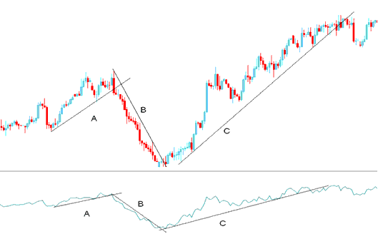
From chart above we can separate the chart into 3 parts, part A, B and C.
A - Upward indices trend-line on chart as well as on the Accumulation/Distribution
B - Downward indices trend-line on chart as well as on the Accumulation/Distribution
C - Upward indices trend-line on chart as well as on the Accumulation/Distribution
As long as the stock indices price & the indicator are moving in the same direction then the stock indices price move has enough momentum to continue moving in that direction as shown above
Stock Indices Trendline Break
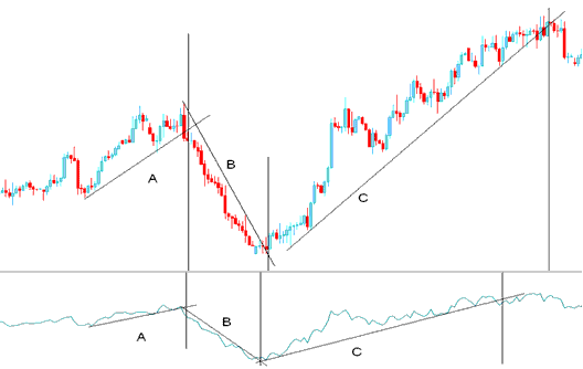
From the above chart we can see that once the trend line on the AD was broken then the stock indices price trend line was also broken.
Looking at the chart below we have added vertical lines to represent the points where the trend lines were broken, both on the stock indices price chart and the indicator.
Comparing the trend lines on the indicator & the stock indices price those of the AD were broken before those of the chart. This is because volume always precedes indices price.
Trading Signals
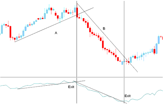
Exit
Exit signals are generated when the trend line on the Accumulation/Distribution is broken. A indices trendline break on the technical indicator warns of a possible reversal.
Entry
Once the trend line on the AD is broken it warns of a possible reversal in direction of the market.
However if we want to take a trade in the opposite direction it's always best to wait for a confirmation signal.
A confirmation signal is considered complete once both the indicator & the stock indices price breaks both their indices trend lines.
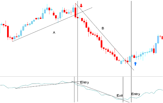
Entry Signal Generated by Indices Trend Reversal
